Now that the contest is finished and while waiting for results, I can take some time to explain the design of uTranslate.
First, I had big constraints : only 3 weeks available, no knowledge of QML. So I had to choose a simple subject. A subject that needs as few as possible work for the engine and that allows me to work on the UI.
For my own needs, I thought about a traffic app (a port of an android GPL app). But after digging into the code, it was not so simple : gathering datas was an ajax request, but rendering them involved a lot of work. My next need was a translation app. After few searches, I found the glosbe website, with their open API (an ajax request) and their call for opensource. Bingo ! it'll be a translation app.
A friend of mine is german and I looked at her using her iPhone to translate some words while we were talking. So use cases were defined "live" !
- she starts app, type first letters of a german word, app suggest a list of words, select one suggestion and she sees the french translation (the lang german/french were predefined)
- I take her phone, switch language, and perform another similar translation
The main idea is "efficient" : every saved click/tap is very important :
- when the app is started, it must be able to receive immediately an
input form user :
- the lang must be what the user has already defined
- the focus is on the search text
- list of suggestions is very important : it allow the user to NOT type other characters
- given the small screen size on phones, the list of suggestions should appear above other elements.
The Glosbe API bring some changes : it allows 2 calls : one for translation, another for definition. How can I integrate that ? A first idea is tab under the search text.
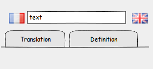
But in the Ubuntu Touch UI, tabs are always at the top of the screen. And each tab has his own content. So I thought that it would be interesting that both tabs share the same context : the languages and the search text should be identical in both tabs.
I made a very first prototype to discover QML and test this idea. Thanks to QtCreator autocomplete feature, I quickly found the 'onSelectedTabChanged' and 'onSelectedTabIndexChanged' : my idea was working well ! The core of uTranslate was ok.
Then, the "popopver" effect of suggestion list was made with the "z" property. Plus 2 animation for expand/reduce. Cool.
Initially, there was more buttons beside the search text : a "search" button and a "switch" button for the "translation" tab. But after some testing, it appeared that :
- "search" button is useless : we always use the suggestion list or the "enter" key on keyboard,
- the "switch" button is not so important, so I moved it in the toolbar,
- the look of flags buttons is not very good : I replaced the standard buttons by pure Image with a MouseArea
The result is a very clean search UI, with much bigger flags, without visual annoyance.
Then the "settings" and "about" pages were added in a general PageStack object. When user comes back in translation/definition tab from one those pages, the focus is on the search text and suggestion list appears : the app must always help user find a word. If it doesn't behaves like that, it's not a feature, it's a bug ! ;-)
As I'm not a graphics designer/artist, I didn't try to define new colors. I know this is a strong effect that help users say an app is beautiful. But it's better I ask someone to do it. I just made a simple icon for the contest.
This is the current version 0.2.1. I think that it fully respect the initial idea : no whizzbang features, just efficient, efficient...
Obviously, I think about some new features, but I'll try to always keep that initial idea of efficiency.
PS : Oh, I forgot to tell that the ".1" in "0.2.1" is because I found the U1db bug ! it was the filename in the definition of the database. Weird...